“It seems that the main focus of painting is to give pleasure,” the painter Robert Ryman said. “If someone can receive pleasure from looking at paintings, then that’s the best thing that can happen.” If you have interest in the pleasures of looking at paintings, this is a really good month.
Sherrie Wolf and Jan Reaves, showing at Laura Russo Gallery, work at opposite ends of the old false dichotomy between representational and abstract painting. Wolf paints still-lifes in a very tight realist way, and Reaves paints big bold painterly abstractions.

Sherrie Wolf, Sunflowers, 2016, oil on canvas, 50 x 50 inches
In a recent essay bemoaning the state of painting pedagogy that nowadays mistakes verbal critical thinking for the knowledge of painting acquired through the practice of actual painting skills, Laurie Fendrich says, “every painting exists in the long shadow of great paintings of the past.” Sherrie Wolf illustrates her shadows both by quoting the classic objects of still-life—glassware, crockery, fruits and vegetables, vases of tulips—and by incorporating images of “great paintings of the past” in her paintings of the present. The genre of still-life doesn’t have the meaning it had in its 17th century beginning. What was exotic, expensive or symbolic centuries ago in great still-life painting is now ordinary. We can buy fresh fruit at any time of the year. Glassware is cheap. Tulips used to be fantastically expensive, and the short life of flowers and insects could symbolize mortality. What once were possessions of the rich have become everyday stuff. Wolf’s paintings are about using mundane subjects richly.
Wolf’s paintings tend to be much bigger than classic table-top still-lifes. We don’t think “big and bold” when we think “still-life” (exceptions are the big dead game pictures for hunting lodges). Cascade, 2016, is six by four feet. There are two layers of table-top. In the upper back is a small table, draped in green, supporting a silver dish with pitcher and fruit. Cascading across the next level of big table we find several bowls and plates of fruits and vegetables, a vase of yellow tulips, a vase of purple tulips and illustrations of famous artworks by Delacroix, Manet, Van Gogh, and Stuart. There are several dozen objects in this picture including eight different colors of drapery that frame the edges of the scene. Roy Lichtenstein said, “Painting stems from a sense of organization.” Here is one heck of an example.

Sherrie Wolf, Cascade, 2016, oil on canvas, 72 x 42 inches
The most prominent art illustration in Cascade is the Landsdowne portrait of George Washington by Gilbert Stuart. It lies as if under glass on the big table-top with objects carefully placed atop it. Washington’s face stares up from the center of the picture. His head becomes part of the line of tumbling ovals, fruits and tulips, that activate the lower half of the painting. A tall glass sits on Washington’s shoulder. A goblet blocks his other shoulder. Atop the goblet lies a feather (a reference to quill pens of the 18th century?) pointing off to the left, and just below that feather is Washington’s arm, mimicking the feather by gesturing to the left. In the portrait there is a table below Washington’s arm and a red drapery hangs across its corner. This is echoed by the red drapery at the edge of Wolf’s painting. Just looking at how Wolf has incorporated this one image among the plethora of objects is enough to make a head spin. Consider this one spun.
There’s a place for everything and everything is in its place in Wolf still-lifes. Cascade is the most complex one in the show, but every one is a marvel of taut composition. These still-lifes are full of old references, but in the old days the compositions tended to be tightly centralized arrangements. In many of Wolf’s works things are strewn (yet perfectly placed) from edge-to-edge, in fact past the edge, cropped like a photograph crops a scene. Wolf does not mimic past techniques or the dark moods of 17th century Dutch still-life. Her painting method does not seek to “fool-the-eye” and her pictures are brightly colored. Objects are strongly lit. Colors are bright.
Self Portrait: No Description is as Difficult as the Description of Self, 2016, is an anomaly, a dark nine-foot tall painting. It pays direct homage to Las Meninas by Velázquez by giving us just the slice of Las Meninas that depicts the artist at work. Wolf assumes the same pose wearing the same garb as Velázquez, with the same thumb-hole palette. The fancy dress of one of the Spanish court maids of honor becomes a flow of drapery, and on the floor are favorite subjects from Wolf’s art: a vase with tulip, a plate with pear. There are just a few objects in this painting (the artist becomes an object too), but again all are exquisitely placed (note the inverted V of drapery containing the gesture of the tulip, a tulip opening up to gesture into that space). Instead of seeing the king and queen reflected in a mirror in the background, Wolf places the painting Judith beheading Holofernes, c. 1614-1620, by Artemisia Gentileschi, deeply in shadow. This is a favorite painting for art-knowledgeable feminists (both Judith, who killed the Assyrian general Holofernes in defense of the city Bethulia in the 6th century bce, and Gentileschi, a prominent 17th century artist, are commemorated in Judy Chicago’s key feminist work The Dinner Party, a huge installation now permanently at the Brooklyn Museum). Meaning here revolves around our speculation about how Wolf considers herself vis-à-vis Velazquez and Gentileschi, and maybe Judith.
The pleasure of viewing Wolf’s art is in marveling at how lots of small things are put together. In the paintings of Jan Reaves the pleasure is in empathizing with the dance of gestures she makes with paint. Her best paintings are the three big ones, about six by six feet each. They are assembled from brushy loopy open shapes, ranging from circles to ellipses to teardrops, that tumble across the foreground.
-

- Jan Reaves, “Influence Peddler,” 2016, acrylic on canvas, 71.75 x 71.75 inches
-

- Jan Reaves, Eye Shine, 2016, oil and acrylic on canvas, 71.75 x 67.5 inches

-

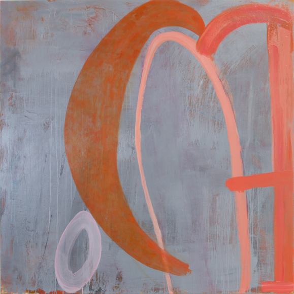
- Jan Reaves, Rigorous Devotion, 2016, oil and acrylic on canvas, 71.75 x 71.75 inches
Influence Peddler, 2016, is the busiest, with a riot of background color and a line of small ovals, sitting like birds on a wire, across a mid-horizontal brushstroke. Ovals float above them while below a pair of big ovals sit on another shelf of horizontal strokes at the bottom. The floating ovals provide action while the big pair provides a firm anchor. Overall there’s a light “hey, it’s a party!” feeling. Eye Shine, 2016, is a flutter of pink ovals on the right over a moody dark blue background we see at the left. The size of Reaves’s gestures is the first impression, and then we notice the sophistication of the color. Look at the range of pinks in those ovals. Look at the bouquet of color in the back of Influence Peddler. And with Rigorous Devotion, 2016, note the layers of soft color hidden by an overall gray wash in the background field.
There are only four shapes in Rigorous Devotion—one small (pink!) full oval and two big arcing (part oval) vermillion gestures along with a tall vertical shape at the right edge. Here the gestures are monumental. This painting does not invite us so much as it confronts us assertively. With just these three big canvases, Reaves gives a small survey of the possibilities of feeling to be found in painting in the long shadow of abstract expressionism.
I recall Brice Marden saying that the best painters are the “really old ones.” Wolf and Reaves (and Stephen Hayes whose work is now at Elizabeth Leach Gallery) are all well into their AARP years (as is this writer), but not yet to the “really old” stage. Right now they are making damn fine paintings. Just wait.