The Hallie Ford Museum of Art’s major new retrospective on the work of Portland artist Mel Katz continues at the Salem museum through August 23. ArtsWatch’s Barry Johnson, who wrote the essay that accompanies the exhibition’s catalog, considers different ways to approach Katz’s seemingly odd but rigorous work.
The opening of the Mel Katz retrospective, Mel Katz: On and Off the Wall, attracted a large crowd to the Hallie Ford Museum of Art in Salem on Friday night, including the artist and a van full of family and friends down from Portland. In the back room of the gallery, I stopped to talk to Mel’s son Jesse, and he looked around and noted that it looked like a “funhouse” in there. I had to agree. The tall, colorful sculptures in that room stand close together, and with their different materials and odd shapes, maybe they do seem a little clownlike. And I mean that in a good way. The bright “Katz colors” of his wall sculptures (he once tracked down the mixer of Calder’s famous red paint, but couldn’t get the formula, so he invented his own), the weird juxtapositions of various Formica surfaces that he used for a time in the 1980s, and the odd shapes of rugged steel sculptures and the finer textures and lines of his aluminum pieces combined to make the Hallie Ford Museum quite festive.
That was the first revelation of the exhibition for me. How much fun these peculiar artworks generate when you collect them in one place. I understood them pretty well as individual objects, I thought, because I had written the catalog essay for the show in a four-month burst at the end of last year, aided greatly by the artist himself and museum director John Olbrantz. But I hadn’t imagined the effect of them in close proximity, even though Mel had shown me various provisional exhibition diagrams during our talks together. The powerful, occasionally goofy sensory impressions they sparked were sometimes overwhelming. As Mel might say, “Who knew?”
So, yes, having already written quite a bit on Katz’s work, I’m not going to dissect again here and now. That wouldn’t be seemly! But I had a few stray thoughts about the show that I’m going to try to corral for you here, just to switch to a ranching metaphor, having exhausted circuses. Mostly, I want to talk about how we viewers can come to grips with an art career that produced an object such as this one…
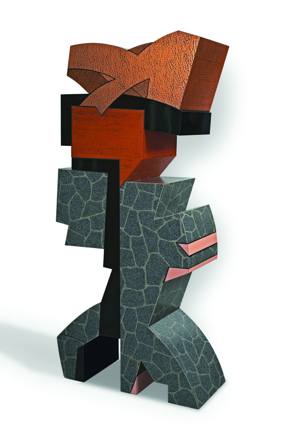
Mel Katz, “Flagstone,” 1987, plastic laminate over wood, 84 x 42 x 17.5 in., collection of the Tacoma Art Museum/
Photo courtesy of Richard Nicol.
That’s called “Flagstone,” naturally, because some of the plastic laminates he used to cover it look like flagstones. That copper section is pretty inviting—on opening night I caught one older visitor surreptitiously running his fingers over those delightful looking ridges. I’m partial to the red granite shape right below the copper, which reminds me of the outline of the state of Pennsylvania. And Katz has a way with pink accents, too.
Anyway, it’s fun to look at, and so are the other Formica and linoleum and Marmoleum pieces in this 1987-88 series and the show. But it started to make more “sense” as an art piece (and goodness knows I’m about to stretch the meaning of sense here), at least for me, when I understood that it was part of a much larger engagement with the rules of art, a subversion maybe, or as critic Harold Rosenberg called it, a de-definition of art, begun by mostly American artists in the 1950s, specifically Robert Rauschenberg and Jasper Johns). Their work critiqued and then pushed aside Abstract Expressionism, which had become the new orthodoxy, and started to chisel away at the problem of what constituted an art object, and then, what constituted an art experience. By the late ‘60s and early ‘70s the results of their explorations ranged from shaped canvases (which Katz himself made) to happenings, with Minimalism, Conceptual Art and Earth art playing a major part.

Mel Katz, “Ribbons III,” 1967, oil on Masonite with zinc, 48 x 50 in., Reed College Art Collection/Photo courtesy of Robert Krueger.
Katz had moved to Portland in 1964 with these ideas in his head, and within a couple of years he had started to figure out his way forward. And the work he started to produce was actually in conversation with the work of the major new artists at that time—Frank Stella, Carl Andres, Donald Judd, Richard Serra, Sol LeWitt—more than anything going on in Portland. Fortunately, for the conversation, Katz had begun Portland Center for the Visual Arts in 1972 with fellow artists Mike Russo and Jay Backstrand, and PCVA promptly invited all of the artists I’ve just mentioned and dozens more to show their work here. Even though the honorarium was tiny, they accepted, and Portland became an outpost for the most adventurous art in the country.
“Flagstone” fits right into that mode of artmaking. A freely available manufactured material here, some complex shape-making there, a whimsical sense of color and material, with perhaps a little nod (or smirk?) toward Minimalism, and then just the strangeness of it all. If it doesn’t seem strange, that’s likely because the viewer has seen other examples of this late-modernist art, and those had stretched or even undone previously held definitions of what art was.
*****

“White Series #3,” 1971, charcoal, polyester, foam; 88 x 42 x 12 in., collection of the Tacoma Art Museum/Photo courtesy of Richard Nicol.
I found my own foothold on “Flagstone” or, even odder, at least to me, the White Series works (at left), with the help of other writers. Katz’s work here received more attention than that of many other artists, and some of that attention came in the form of reviews and catalog essays written for museum shows. The most important for me came from Paul Sutinen, who studied under Katz at Portland State University (he remembers Katz calling the peach sherbet color of one of his paintings “insipid”) and wrote about him many times for Willamette Week. I happened to be Sutinen’s editor for a time at Willamette Week, back in the early 1980s, and we’ve kept in touch over the years. When I started working on the catalog essay for this show, I immediately emailed him and set up a series of meetings to talk about Katz. Sutinen tracked Katz’s work for Willamette Week and then for Marylhurst University’s Art Gym exhibitions. In fact, you can read his pieces in their entirety on his blog.
Here is Sutinen on Katz’s Post Series, just so you know what I’m talking about: “The front is not just colored, it is built of color. Liquid swaths of colored polyester are pulled across, layer over layer. Puddling allows one color to be seen through another; violet may be seen through pale-yellow, for example.” No one has looked more carefully, at an almost atomic level, at Katz’s work than Sutinen has.
I read the analysis of other writers, too. John S. Weber, who was the Portland Art Museum’s curator of contemporary art for a spell before leaving the city for a distinguished career in museum education and curatorial departments, curated a retrospective of Katz’s work at the museum in 1988 that was particularly excellent. Here is his summation of Katz’s work to that point: “For over twenty years, Mel Katz’s art has been rooted in the philosophical scrutiny which Minimal and Conceptual Art brought to bear on Abstract Expressionism. His oeuvre offers an unusually rich exploration and synthesis of these crucial postwar traditions, propelling him into one of the central debates of contemporary art.” That’s quoted in the catalog essay that I assembled for this show, as is the Sutinen quote above.

“Still Life,” 2006, painted aluminum, 29 x 12.75 x 6 in., collection of Arlene and Harold Schnitzer/
Photo courtesy of Richard Gehrke.
Bruce Guenther, Terri Hopkins, Kay Slusarenko, the painter Michele Russo, Roger Hull, Randy Gragg, Sue Taylor, Richard Speer—a lot of writers make appearances in that essay. Sometimes in debate with each other, sometimes in affirmation, always helping to build better descriptions of the work at hand. Katz was lucky to have so many observers writing so well about his career, and as I wrote the essay, I worried that today’s artists aren’t receiving the same degree of close scrutiny from so many sources, each wrestling with the problem of representing and making sense of their work. If anything, today’s art environment is even more complex than the one in which Katz found his footing, the work at least as mystifying, and our capacity to think about it consecutively diminished by the sheer volume and the attention span of the Digital Age.
Some of the pleasures of Mel’s work are immediate. They can be delightful and witty; they make you smile. But other pleasures await those who start asking some questions about where they came from, how they arrived here, what they are saying. Not that we can ever answer them completely, but for me at least, the real satisfactions are found down that road.