Guest-edited by “Portland as F*ck” columnist Ian Karmel.
For the month of February and a bit beyond, Peoples Gallery and Compound Gallery have played host to concurrent Portland-themed group art shows. Compound’s “Portland as F*ck” cooperated with the Portland Mercury, showing mainstays like Brett Superstar, Tripper Dungan and Mercury art director Justin “Scrappers” Morrison. Peoples Gallery featured poster artist Dan Stiles, and wrangled a huge collection (300+) from artist/curator Chris Haberman’s many friends.
Though the works are incredibly diverse and the shows are full of surprises, a few pieces in particular seem to exemplify the last decade’s prevailing local art trends. Each of these broadly-defined styles emerged in turn—but subsequently, none of them went away. Now they all coexist and converse at the same time the latest iterations are evolving. Here, then, is a review of two current shows, reframed as a broad retrospective of visual schools.
The Comicbook Punks
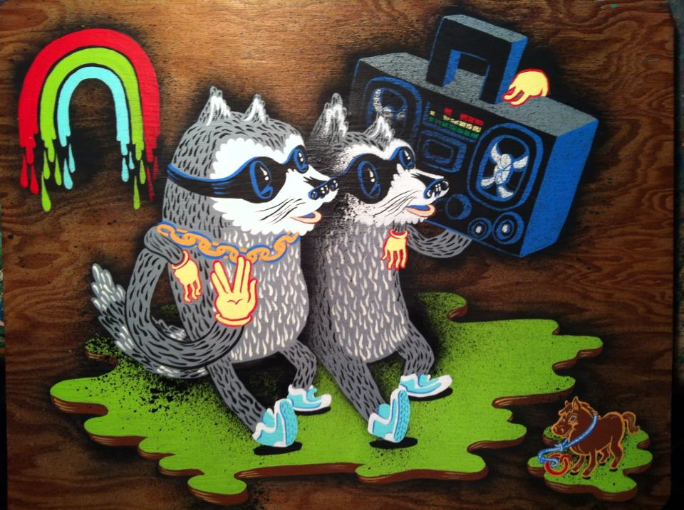
Tripper Dungan’s brand of cartoon and graffiti fusion is representative of a look that dominated Portland’s viz-arts subculture in the early to 2000s. Here he even references a contemporary—Scott Wayne Indiana—with the iconic tethered toy horse in the right lower corner. (Peoples)

Alex Chiu’s “Yeti at a Cafe”—though modernized by its crisp white background—is at home in the cartoon creature ouvre explored by Dungan and by the influential Justin “Scrappers” Morrison. (Compound)
In the early 2000s, young Portland artists created a wave of cartoonish, creature-centered, graffiti-and-comic-infused juvenalia. For a time, cartoon animals dominated the Alberta arts district, young artists’ collectives, poster design and even graphic novels like Craig Thompson’s “Goodbye Chunky Rice” before bubbling up into more mainstream use mid-decade, probably thanks locally to the increasing popularity of Alberta’s Last Thursday and the growing influence of Portland Zine Symposium and Stumptown Comics Fest. Meanwhile, artists like Scrappers served as fire-bringers to locally-based ad giant Wieden + Kennedy, who took these viz trends national around the same time that NYT writer Christopher Noxon published generational manifesto “Rejuvenile.”
The December-ish

Brooke Weeber’s “Flock of Beards” features the low-contrast palette, the curlicues, and the seafaring motifs most closely associated with the Decemberists’ viz-arts wave. (Compound)

Jennifer Parks’ “Portland You Have My Heart”: again, curlicues, ribbon, a subdued palette ruled by ivory and black. (Compound)
As Portland literary prog-rock band The Decemberists rose to prominence mid last decade (even earning “the Colbert bump” by 2009), so did their aesthetic, largely penned by then poster artist and later children’s book illustrator Carson Ellis. Still highly stylized but much more subdued and romantic, these works incorporated more human subjects, embellished with ribbons, cursive, seaworthy scrimshaw patterns, and other flourishes of faux-antiquity. This neo-romantic style adorned so many album covers nationwide that it even started to reverse-engineer fashions, reviving the market locally for dandy fitted suits from Duchess and erstwhile-extinct accessories like bowler hats and watch fobs.
The Hybrids

Adam Cook uses illustrative technique to lend complexity to his critter-plus-Portlander motif. Composition-wise, he seems to borrow from an “American Beauty” movie poster image. (Peoples)

Derrick Villalpando’s “Hipster Folk” evenly splits the difference between the two aforementioned styles, with PDX self-awareness that stops just shy of self-parody. (Peoples)
Somewhere between the cartoonish and the ornate, vibrant color has started bleeding back into the mix. Creature whimsy is blending with neoromance and a new breadth of technical acumen. One theory: though Portland artists remain whimsical and self-referencing, an extremely saturated market has galvanized a new level of compositional and realism skill, especially among painters and patrons newer to town. The rise of this style seems to have loosely coincided with the last few years’ developments in the Backspace/Compound blocks near the Pearl—venues that seed their collections with internationally-recognized graffitists and illustrators of the Juxtapoz Magazine ilk. The recent rise of “Portlandia” probably also plays in; these works do a great job of “pulling the Portland aesthetic together” to peddle recognized motifs abroad to newly-minted Portlaphiles.
The New Impressionists

Quin Sweetman’s rendering of a Northwest Portland Taqueria has such a pastel palette and such romanticized blur, it practically channels Monet. (Peoples)
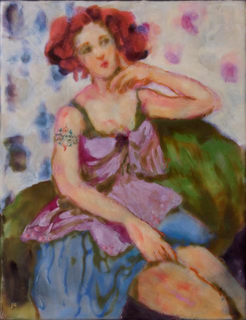
The subject’s arm tattoo in Janet Amundsen Splidsboel’s “Her First Tattoo” may be the biggest tell that this is not a Cassatt. (Peoples)
Oddly enough, Portland artists’ newest inspiration seems to be drawn from old-world aesthetics, particularly European impressionism. While the above styles continue to thrive among their own devotees, neo-impressionist works are gaining an ever-more-noticeable presence. Less about symbols and more about beauty itself, these works soften Portland motifs to the edge of recognition through a rose-colored, blurred nineteenth-century lens, lending an aura of timelessness and universality to local tropes.
Though a thousand Photoshop filters have tried, impressionism remains a difficult art style to digitally approximate. On an ever-dwindling list of formats where the painter’s vision and craft are still considered essential, impressionism is a last refuge for the human touch. As digital effects artists suffer in a down economy, perhaps this painterly mini-renaissance is a backlash? If this new impressionism can become de rigueur, its artists will have deftly painted their specialized skills back into the economic picture.
The Takeaway
Though many impulses contribute to a given art movement (novelty, politics, fashion) this progression of styles could be seen as our oversaturated art market’s (albeit unconscious) impulse to thin the competition.
A quick thought experiment to demonstrate: Take 100 artists who have come to Portland after hearing that the town is “artistic.” Ask, “How many of you can paint me a three-color sasquatch monster?” Maybe 80. “How about drawing me an architecturally accurate square-rigger ship and a dandy gentleman festooned in ribbons, surrounded by delicate forest fauna?” Maybe 50. “Now how many of you can combine those two ideas and compose and shade it so it’s ready to run in Juxtapoz?” That might bring us down to 30 or 20…or less. “Now how many of you went to art school, studied the old masters, and can approximate classic impressionism?” Five? Ten? With every new technical refinement, the pool of participants gets slightly smaller. But if this winnowing process is happening, it’s a distinct departure from our town’s traditionally come-one-come-all arts attitude. Maybe that’s why none of the styles that have come before seem to die. Regardless of the latest “look,” monster paintings are still invited to the Portland party.
It almost goes without saying that this assessment of 2-D vis-art trend is a non-comprehensive art discussion, notably excluding the impact of major forces like TBA, the DIY craft movement, social practice, PAM’s contemporary curation, and the applied design movement (introduced locally by the likes of John Grade, and now basking in MoMa‘s international spotlight.) Still, for those of us who’ve spent the last decade vibing Portland zeitgeists (especially in coffee shops, small galleries, and people’s homes) these aesthetics seem like viable highlights. Feel free to comment on these, or other visual movements you’ve seen around town.