One of the dominant art doctrines during the Renaissance argued that art was “an allegory of the mind of God,” an imitation of a hidden reality, a form of revelation. Culture critic and historian Raymond Williams teased out this one (along with three other aesthetic philosophies) in “The Long Revolution,” and it seems especially pertinent to abstract art, some of which has a specific spiritual connection, after all, as early abstractionist Wassily Kandinsky made clear.
Approaching the ten artists and 32 artworks in the Marylhurst Art Gym’s “and from the distance one might never imagine that it is alive” with the idea of the hidden made visible in mind leads to some happily perplexing moments.

‘and from this distance one might never imagine that it is alive,’ (left to right) Grant Hottle, Ron Graff, and Amy Bernstein, 2015. Courtesy of The Art Gym. Amy Bernstein’s “Flesh of My Flesh” is at the far right.
For example, Amy Bernstein’s “Flesh of My Flesh” gathers a set of small splashes, ribbons, and shapes of thick oil paint on a gleaming white canvas. How should we interpret those individual gestures and the painting as a whole? What hidden reality does it reveal? Something about the nature of pure paint, its elements, perhaps, the attraction of color—bright blue, red, purple striated with white—deployed in various small splotches? Or the mind of the painter who deployed them in just this way, which seems random but is not? Is this the way God creates, and what would the implications of THAT be?
Blake Shell, the exhibit’s curator and Art Gym director, picked out a set of four of Pat Boas’s Sumi ink on paper pieces, gradations of gray, pale to nearly opaque, layer upon layer, curves and lines, diagonals, verticals and horizontals. The hidden reality might be that the universe conceals as it reveals; or, that the number of veils between us and reality is countless. Of course, if Shell had picked a different four pieces from the same set, called “Unalphabetic,” which overlay the Sumi ink with a riot of bright colors, shapes and lines in gouache and watercolor, then the thinking might be entirely different.

and from this distance one might never imagine that it is alive, (left to right) Michelle Ross, Grant Hottle, and Ron Graff, 2015. Courtesy of The Art Gym
My point isn’t to argue that art IS an allegory of the mind of God. Another doctrine that replaced the Renaissance attempts to square the aesthetic ideas of Aristotle, Plato and Christianity, gradually gained strength, according to Raymond’s account: Nature is God’s creation; art is man’s. He quotes the poet Tasso: “There are two creators: God and the Poet.” I suppose a poet would say that?
No, my point is simply to observe that if we’re going to get anything out of “and from the distance one might never imagine that it is alive,” an exhibition of abstract work, it will involve some interpretation on our part after we’ve spent some time observing the art. In that speculation, anything goes, from thoughts about the divine mind (or its absence) to a sudden, non-biblical revelation about a color combination that might work in the kitchen.
Boas, who shows regularly at Elizabeth Leach and is the director of Portland State’s School of Art and Design, has appeared in one other Art Gym group show and one solo show. The latter, “Record Record,” gathered her studies of the New York Times over time:
“Like a Surrealist looking for the ‘automatic writing of the world,’ I traced the outlines of the heads of all the people who appeared on the front pages of The New York Times during 2001, month by month. I preserved the relative position on the page of each outline, creating randomly patterned calligraphic clouds, and began thinking of Freud’s idea of the magic slate as a metaphor for memory. Though newspapers are thrown away and events may be forgotten, they never really vanish. The residue that collects underneath changes how we perceive the topmost layer.”
Another set juxtaposed a regular Tiffany ad in the Times with the photographs of sad international news adjacent. And her “Little People” noted a change in 2008: the Times started featuring fewer stories and photos of the rich and powerful and more of ordinary folks, the little people.

Pat Boas, Blue Spiral Drawing, Sumi ink on paper, 2015, 30 x 22 inches
Other Boas projects involve language and letters, mostly to get at how disembodied they can seem, how distant from representation…of reality, I suppose. Those letters appear in her “Unalphabetic” series, for example.
Is Boas an “abstract artist”? I don’t have a problem including her in that category, but her work is very wide-ranging. The “little people” are depicted photo-realistically, almost. But then, most of the artists in the show are equally wide-ranging; some of their work is more “abstract” than other strands are, at least to me.
 So, Calvin Ross Carl, who graduated from PNCA in 2008 and is co-director of Carl & Sloan Contemporary, is represented by three acrylic on canvas paintings that feature English phrases on top of backgrounds of paint that resemble cake icing at an old-fashioned bakery. One says, “You Are Doing OKAY.” To keep you guessing, though, another says, “Good Days Gone Kill More Time.” Carl and Boas lead us to consider how “abstract” versus how “representational” language is.
On the other hand, Carl has also painted some pattern pieces that are more clearly abstract, in the old-fashioned sense, than these. Still, I like this current project: The phrase most germane to our considerations here might be 2014’s “Stop Believing (Things You Can’t See)” at HQHQ gallery.
Michael Lazarus, who earned his MFA at the School of Visual Arts in New York in 1994, is represented here by wall pieces that gather found materials and set them on wood (mostly) and employ acrylic for color purposes. They are figures, heads with eyes, like one that fit right into Adams and Ollman gallery’s “Key Figures” exhibition, but similar constructions feature words. For example, he was in the Elizabeth Leach “Words, Words, Words” show (with Pat Boas). His message in that show: a “Keep Out” sign below the phrase, “Getthefuckawayfromme.”

and from this distance one might never imagine that it is alive, (left to right) Amanda Wojick, Michelle Ross, and Michael Lazarus, 2015. Courtesy of The Art Gym.
But really, explore the histories of any of the artists in the show and their use of varieties of media, forms and ideas becomes apparent. The contemporary artist in general seems restless in this way, developing practices that aren’t confined to particular materials and approaches.
At the end of 2012, the Museum of Modern Art in New York opened “Inventing Abstraction, 1910-1925,” “a dizzying, magisterial cornucopia” of an exhibition according to Roberta Smith of the New York Times, collecting 350+ pieces of early abstract works. If you look them over, you can find suggestions of what was to come in abstract work, with the possible exception of Abstract Expressionism. I suppose typologically speaking, Picasso by himself predicts most of it, maybe?

Grant Hottle, Bloodstone, Oil on canvas, 2015, 30 x 24 inches
Anyway, Arp’s painted wood pieces in that show resemble Lazarus’s work, just a little (some others remind me of Frank Stella). Alvin Coburn’s photographs have some connection in my mind with Grant Hottle’s abstract oils in “and from the distance one might never imagine that it is alive,” which have similar hard edges and layers. Hottle’s paintings (he teaches at Clark College in Vancouver and is also associated with Oregon College of Art and Craft) are ravishing, in their way. Here’s what he told Noise & Color PDX in early 2015:
“I’m really comfortable with abstraction and large scale painting, but I’m also really uncomfortable with the history of macho-ness and confidence with which all of that High Modernism was loaded…with these sensibilities of truth and genius and all that stuff that I don’t buy into. […] I’m a formalist, but I take it seriously in terms of visuals. I don’t think I take it that seriously in terms of philosophy.”
So, maybe no hidden reality here, intentionally at least? I like the variations in the application of paint, from saturated to textural, the color dramas, the play in three dimensions. Somehow these pieces remind me just a little of certain work by early Portland abstractionist Carl Morris, though maybe Hottle would consider Morris’s work an example of High Modernism.
Michelle Ross’s paintings are not as bold as Hottle’s, but they are subtle, lovely things to look at and enjoy purely on the surface, even before the cognitive mind starts trying to shape them for its own purposes. Ross, another Elizabeth Leach artist, manages clean lines and absorbing textural backgrounds, playing with geometric shapes and blotches and subtle color shifts that yes, offer a poetic creation of their own.
I was also drawn to the curious grids of Amanda Wojick, which have many antecedents in the history of abstraction. Wojick, though, who is associate professor and co-chair of the sculpture program the University of Oregon and an Elizabeth Leach artist, shapes her canvas and linen pieces slightly and her grids are handmade, not sharply geometric. In fact, they are only loosely grids, I suppose, each “box” a different size and separated from the rest by lots of white space. They remind me just a little of Frantisek Kupka’s “Nocturne,” in that MoMA show.

Amanda Wojick, Impatiens, Acrylic, Mulberry Paper, Paper Mache, on Linen, 2014, 23 x 22 inches
Now, I’m just roaring through the rest of the ten artists in the show, because they are interesting to look at, too. Curator Shell’s eye for work with lots of visual interest doesn’t let her down here at all.
Ron Graff, associate professor of painting at the University of Oregon since 1980, shows four oil on canvas paintings. “Balancing Act” has a mustard colored background, a large brighter deep yellow shape on top of that, a black line interrupted by arcs, and a patch of four semi-rectangles in the corner, orange, deep-red, pink and black. You may follow that line, embrace that shape, look closely at the subtle variations in the background, or plunge into the rectangles, which share a similar effect with Bernstein’s paintings.
Jack Featherly, an UPFOR Gallery artist, is another artist with work that is more “abstract” (his Ray paintings), but here he is represented by work that is figurative, related to Japanese ukiyo-e work, and deeply involving.

Robert Hardgrave, Castleford, Toner transfer on Tyvek, 2015, 72 x 108 inches
And finally, Robert Hardgrave’s huge Castleford, a toner transfer on Tyvek, a brand of flashspun high-density polyethylene fibers, used to protect buildings during construction, according to Wikipedia, has pride of place in the first gallery in the exhibition. Hardgrave is a Seattle artist who has dived into various materials in his career, including painting murals and acrylic on canvas and burlap. “Castleford” looks techy, even science-fiction-like, and also seems related somehow to early abstract photos, such as Man Ray’s “Rayographs.” I’m still looking at that MoMA show.
Will “and from the distance one might never imagine that it is alive” draw you closer to the divine, to some Platonic ideal of Beauty, to an idealization of nature? Possibly, but Renaissance art theory does have its limits. It does suggest, though, that there are artist worlds out there that, while they may pull lots of real world images, materials and associations into their orbit, operate according to a logic, analysis and/or imagination of their own. Perhaps, not unlike your own.
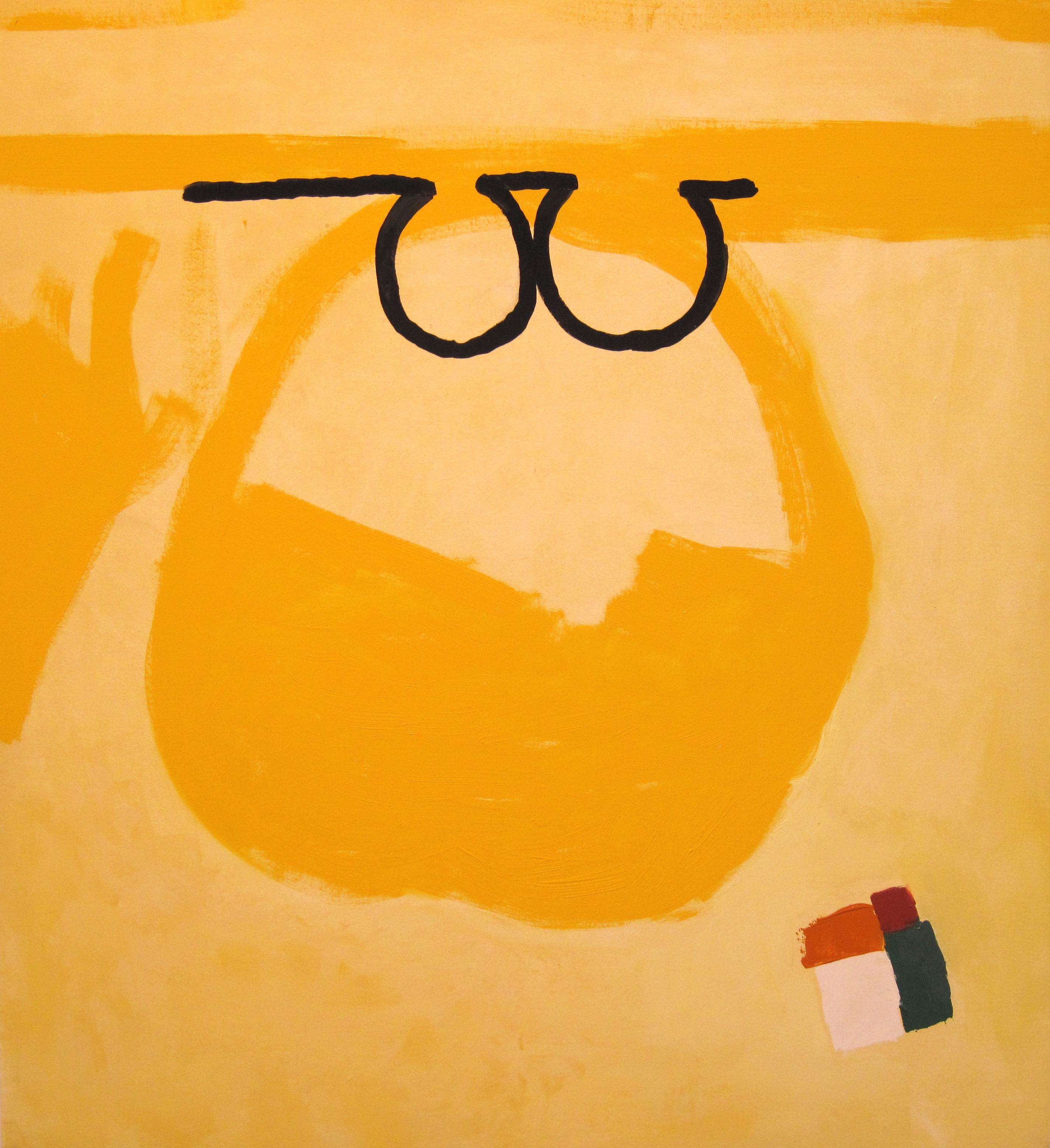
Ron Graff, Balancing Act, Oil on canvas, 2015, 38 x 35 inches
NOTES
The exhibition continues at Marylhurst University through March 5. Marylhurst is just south of Lake Oswego on Highway 43. A catalog for the show will published in the spring.