There’s a tantalizing little glimpse of Robert Colescott’s work at Laura Russo Gallery right now. Colescott (1925-2009) was an important American painter, representing the United States in the Venice Biennale in 1997. He is probably best known for his satirical paintings of the 1970s in which he, as a black artist, lampooned racist caricature stereotypes in works such as George Washington Carver Crossing the Delaware: Page From an American History Textbook, 1975, a take off on Washington Crossing the Delaware, 1851, by Emanuel Leutze.
In a 1999 interview, Colescott said of these overt paintings, “it’s about white perceptions of black people. And they may not be pretty. And they may be stupid…it’s satire. It’s the satire that kills the serpent, you know.” These blatant works were very controversial, and 40 years later they are still powerful for their imagery. But we should not overlook the idea that they are also powerful because they are fine paintings.
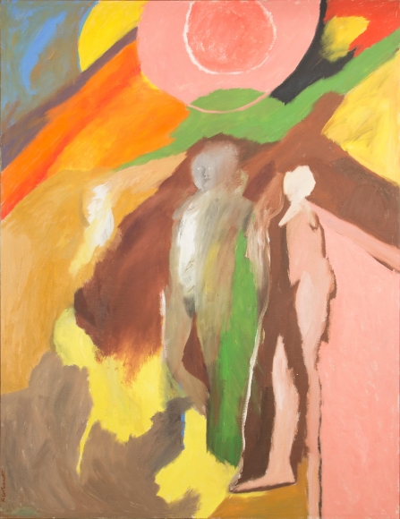
Robert Colescott, “Call to the Valley”, 1965, oil on canvas, 77.5 x 58.75 inches/Courtesy Laura Russo Gallery
There are none of the 1970s works in the current small show. There is a big painting from 1965, a couple of big works from the 1990s, and a few works on paper. The 1965 painting, from a time when he taught at Portland State University, Call to the Valley, (about six and a half -by-five feet) is sort of a regular painting for its day. There are ambiguous figures in an ambiguous landscape. Call to the Valley was painted when Colescott was 40 years old. It speaks of a painter dealing with then current painting issues, but not yet finding a strong individual voice. It seems that the subject matter of the 1970s gave Colescott his individualism—so he could paint like he really meant it.
A Fool There Was… Europe–Africa, 1992, (about seven- by-six feet) was made when Colescott was 67. It is an amazing painting. Call to the Valley is quiet. A Fool There Was… Europe–Africa is a riot. There are over a dozen faces and figures rendered in Colescott’s mature cartoonish exaggerated style. It has the ambiguous space like Call to the Valley, but it is a far more complex, clear yet dreamlike, space. Things do not blur into each other. At the time Colescott made this work he would begin by painting his whole canvas alizarin crimson, giving him a color to work against and giving his paintings a rich warm glow from the interstices between images. In this painting the crimson is the primary color.
A big red female nude wearing platform sandals takes up the whole of the center. She is defined by sophisticated line drawing that dances around her body and her hair—and the line defines what seems to be a reclining male figure behind her. Her hair glows as the crimson shimmers electrically. Below and flanking the central figure sit two solid female nudes symbolizing Europe and Africa. In the interview Colescott said that he wanted to “connect with historical painting.” He found his way of doing that, here utilizing classical nudes and classical personifications of geography. Behind these two figures we peek at line drawings of nudes in amorous embrace. Above everything hover three faces, and through an opening between the reclining man’s “legs,” there is a little distant view of a beachy scene.

Robert Colescott, “A Fool There Was… Europe–Africa”, 1992, acrylic on canvas, 84 x 72 inches/Courtesy Laura Russo Gallery
Imagery grabs attention first in this painting, but how that imagery is rendered—the marvelous juggling act of composition, the exactitude of line in the drawing, sure smooshes with just the right brushiness of paint, the hot color—keeps us looking. Perhaps this painting has something to do with Colescott’s dichotomy: his African heritage and his interest in the European tradition of art making (he studied with Fernand Léger in Paris), or maybe the dichotomy of the sacred (“art” personified by the classical nudes) and the profane (mundane nudes, sexuality). This painting reveals no specific commentary, just images that bounce off each other as dreams skip from place to place. Colescott said, “…in the first place the way that one serves is to serve art first…And the way you serve art is by being yourself.” This painting is a great example of how that works. By the age of 67 he had it figured out.
I had two close encounters, or rather “almost encounters,” with Robert Colescott. He taught at Portland State University from 1957 to 1966. I was a freshman there in fall 1967—just missed the possibility of studying painting with him. In the mid-1970s I saw a small Colescott painting in the back room of The Fountain Gallery (where Colescott had his first one-person show in 1963). It was maybe a foot tall. It was priced at $90. I thought about how I might be able to buy it, but $90 was a lot of money to me as I was working part time for minimum wage and writing for Willamette Week for three cents a word. In 1977 the Hughes Building, which housed the Fountain and several artists’ studios, burned down. The painting was gone.
The Colescott show hangs in the back galleries at Laura Russo: Up front are dozens of painted ceramic heads by J. D. Perkin. While the Colescott show gives just a suggestion of Colescott’s achievement, Perkin’s is a major exhibition of what seems to be breakthrough work.

J.D. Perkin, “Island” (installation view), 2016, ceramic and wood, 44 x 144 x 144 inches/Courtesy Laura Russo Gallery
I hadn’t known Perkin’s sculpture before this show. Looking at his web site I see previous works that are plays with anonymous generalized figures. While those look smoothly refined, this show is the opposite. This is wild and crazy stuff, yet refined in a non-smooth way. There are dozens of over-life-size heads. A few are placed individually on stands, but most sit on a five-tiered mountain titled Island.
The works make me feel as though the sculptor had a burst of “what the hell, why not?” energy. There is a wide variety of painted heads—white, black, nurse, clown, wolf, human with horns, human with bird beak. They are usually wildly un-naturalistic. Importantly, the heads are all based on a solid understanding of anatomy. There is a solid feeling of “head” beneath all of the wild inventiveness that Perkin has let loose. Like a painter enjoying paint, Perkin handles clay directly, letting us feel the sculptor feeling the material. For example, most “hair” is rendered as sculptural, non-hairy, form: vertical slabs, spikes, indentations—or sometimes just an area of paint. Perkins utilizes a hat, or nurses cap, crown or a hoodie as much to pull sculptural form from the item as for its personality-giving signal. An eyebrow can be a little slab of clay. A beard can be a big blob of clay.
Harold Rosenberg said that for Abstract Expressionist painters the canvas was “an arena in which to act.” For Perkin the head has become that place for action. In every case there is a feeling of immediacy, as if the sculptor went with his first (good!) instinct, not fussing.